Many of our artists are multifaceted in talent. Monica Schmid, director of Lireille gallery, is not only a metalsmith, but also a fashion designer, a national swimming champion of Switzerland, and recently became a master gardener. This blog "The Artist’s Color Palette in the Garden, Transform a mundane yard into an oasis by using an artist’s color palette" is an article she wrote for
the Master Gardener program of the UC Berkeley Agricultural and Natural Resources. In this wonderful and informative article, she precisely carved out the process of combining artist sensibility into gardening. She graciously agreed to share with us. We hope many of you gardening lovers will benefit from it. Enjoy!
A Note from Monica:
"During my career in fashion design, then in metal arts, I kept my fingers in the soil, so to speak. I was lucky to meet friends connected to the horticulture department at UC Davis. They became my mentors and ultimately encouraged me to enroll in the Master Gardener Program.
My connection to plants and the environment dates back to my childhood in Switzerland where my uncle and my grade school teacher were my inspiration. My uncle’s garden was an oasis of greenery and a collection of rare native plants. He collected seeds on his hikes and cultivated them in his garden. Each plant had a fascinating story. I spent many vacations at his house and marveled over the collage of colors in his garden.
My other inspiration was my 5th grade school teacher who challenged his class to collect and press/preserve as many native flowers as possible and to identify them by family, species, variety, root type and to label them with their Latin and common names. At the end of the year, I had collected over two hundred plants.
Combining art and horticulture was the perfect fusion of my two passions and resulted in publishing my article “The Artist’s Color Palette in the Garden” on how to transform a mundane garden into a serene oasis.
-- Monica Schmid
Transform a Mundane Yard into an Oasis by Using an Artist’s Color Palette
There is nothing more rewarding for a gardener than turning a patch of soil into an oasis. Whether you are drawn to monochrome palettes or striking, happy colors there are a few principles you can follow to create a sanctuary that reflects your personality.

As an artist, I’m keenly aware of the relationship between shapes, colors, and textures – in essence, the principles I use when I work in my studio. Using these elements to create my garden space has transformed my “yard” into a sanctuary. The garden is my canvas, the colors of the foliage and flowers are my palette. By sharing my approach to create a cohesive garden, I hope to encourage the artist in you.
Choose the Colors
The first step to plan a garden is to decide on a color palette for the flowers as well as colors for foliage and accents. Some of my gardener friends were surprised at the notion that foliage and bark are strong, colorful statements that endure after flowers have gone.
Plan the Space
Start by making a plan and divide the garden space into three sections, front row, middle section, back row. Work on each section separately because each one has a specific function.
- Front row - to create a cohesive first impression all year long
- Middle section - to give splashes of color, to add specimen plants, annuals
- Back row - to frame the garden
Color Palette for Foliage
The colors of flowers and the foliage palette play equally important roles in adding interest. Choose foliage for its color and provide an opportunity to use the “garden” paintbrush. Remember, the colors of green can run from yellow to chartreuse to dark green and from bronze to silvery gray.
Color Palette for Blooms
Choose colors that speak to you, colors you wear often and feel most comfortable in. Think about the colors you like to surround yourself with. Do you have a favorite painting, perhaps Van Gogh’s Starry Night in blues and bright yellows? Do vibrant colors make you feel alive and happy? Or are you drawn to muted pastels that evoke a soft atmosphere? Or do you prefer a monochromatic palette that evokes serenity and calmness?

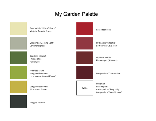
The photos above illustrate the color progression from pale to intense yellow-green, from green to red in the hydrangea and ultimately to the smokey-red of the rose. The rose matches the color of the inspirational urn.
Front Row - Foliage
The front row should host low evergreen shrubs. Some of my favorites for the foreground are variegated Euonymus, Loropetalum, Westringia, boxwood, ‘Cousin Itt’, dwarf bottlebrush ‘Little John’, mondo grass, and many more. The secret to creating a cohesive appearance is to limit the type of shrubs to a select few, rather than introducing many different kinds. Ideally, each foliage color is repeated in at least three places. Juxtaposing evergreen shrubs in a variety of colors in the foreground creates a solid foundation and keeps a garden green all year long. The foliage adds vibrancy even during the grayest winter days. The shrubs will also serve to hide plants in the middle section that have lost their luster after bloom.

Image Source: Monrovia.com
Middle Section - Texture and Color
The middle section is the place for specimen plants and patches of flowers. Use an abundant selection. The only criteria is to stay within your chosen palette and select plants that will grow at least one foot higher than the front row foundation plants.
Adding color and interest in deep shade is often a problem. I found Arthropodium (Renga Lily) and Clivia to be reliable performers and because of their low water requirements, they are well suited as underplantings of large tree canopies. Be sure to plant them away from the tree trunks.
Pay attention to texture as well. Long, strappy leaves of irises for example create a lovely contrast to plants with large leaves, such as Acanthus.
Back Row - Framing the Garden

Choose taller plants for the background so they will frame the planting area and create depth. Again, adding interest with a variety of foliage colors and a mixture of deciduous shrubs such as Ribes, ninebark, Philadelphus, Japanese maples with species of the evergreen Pittosporum, Ceanothus, Michelia, Carpenteria California, and many more, the garden will never look boring.
Selection Process
Once the color scheme is finalized the real fun begins. Remember to stay with the chosen color range. You may be tempted to add too many colors.
Start the online search for plants of the colors you have chosen. If one of the colors is red, search for “red flowers” and click on “Images”. A whole world of possibilities opens right on your desktop! Let the artist in you speak. Be bold. Scroll through the pages and take screenshots of the ones you like. As long as you stay with the color scheme you will end up with a coherent garden. Select red flowers that complement each other. A red Hydrangea with its blooming orbs and large green leaves pairs well with a crimson maple. Crocosmia with its long strappy leaves adds interesting texture and its flowers bridge the palette from red to orange and to yellow. Repeat this process with each color in your palette. No matter what colors you choose, be sure to add white and silvery green for an intense glow during the evenings and at night.
Once you have identified specific plants that could work, do the research and select the plants best suited for your environment and for your set criteria. Choose the search sequence that suits you best, but always stay within the chosen color range. Do a search for each color in your palette. Consider:
- Color
- Environment, sun or shade
- Focal point, a specimen plant
- Water-wise
- Category, such as native, Mediterranean, tropical, mixed, etc.
- Pollinator-friendly
Placement

The placement of colors can be done by drawing a plan with color pencils or setting out the actual plants. However, for many gardeners choosing the placement for flowering plants can be intimidating. Not everyone is blessed with the ability to visualize a concept. Don’t despair. Large photocopies of the blooms on sturdy paper and attached to a garden stake can be a valuable visual aid. Place the stakes in a repetitive pattern all thru the flowerbed. Repetition of colors creates cohesiveness and will draw your eye through the entire garden. Avoid a large clump of one color without repetition unless it’s the strong focal point of the garden. Once the colors are placed, step back and scan at the whole garden with a soft focus. Close your eyes for a while, step away and look at your layout again the next day.
Example - My Garden

I decided on a green, monochromatic garden with musky-red as an accent. My green palette includes many shades from the lightest to the deepest green and from the silvery Westringia to the almost black foliaged Weigela ‘Tuxedo’. The yellow of the variegated Euonymus mirrors perfectly in the yellow-green iris and repeats again in the chartreuse Hydrangea paniculata ‘Limelight’ and yellow-green Alstroemeria. The musk-red accent color was determined by a large urn and I was thrilled to find the matching rose ‘Hot Cocoa’ and Hydrangea ‘Pistachio’. The urn occupies the prime spot close to the center, the rose and the hydrangea repeat the rich red color of the urn in other sections of the garden. Together with the repeat colors of the foliage throughout, the plants have matured into a private little sanctuary.

0 comments